
Tapkey
brand identity · ui/ux · print
Tapkey is an open platform for mobile access—with an open API, Mobile and Lock SDK to integrate smartphone-based access into existing apps and locks.
While employed at Tapkey GmbH I helped developing and evolving the brand image aiming to create a consistent visual language in the overall communication as well as providing an easy-to-use app and web portal.
The initial main target group of end-customers buying lock devices along with the app gradually shifted to integration partners desiring to easily add mobile access to their products and services—requiring continuous design tweaks to meet changing requirements.

The corporate identity redesign approach represented an overall personally relatable, yet trustworthy, reliable, secure and innovative look through clean, simple, spacious layouts with big areas of the corporate blue color, clear typography and imagery, including a simplified logo and app icon.
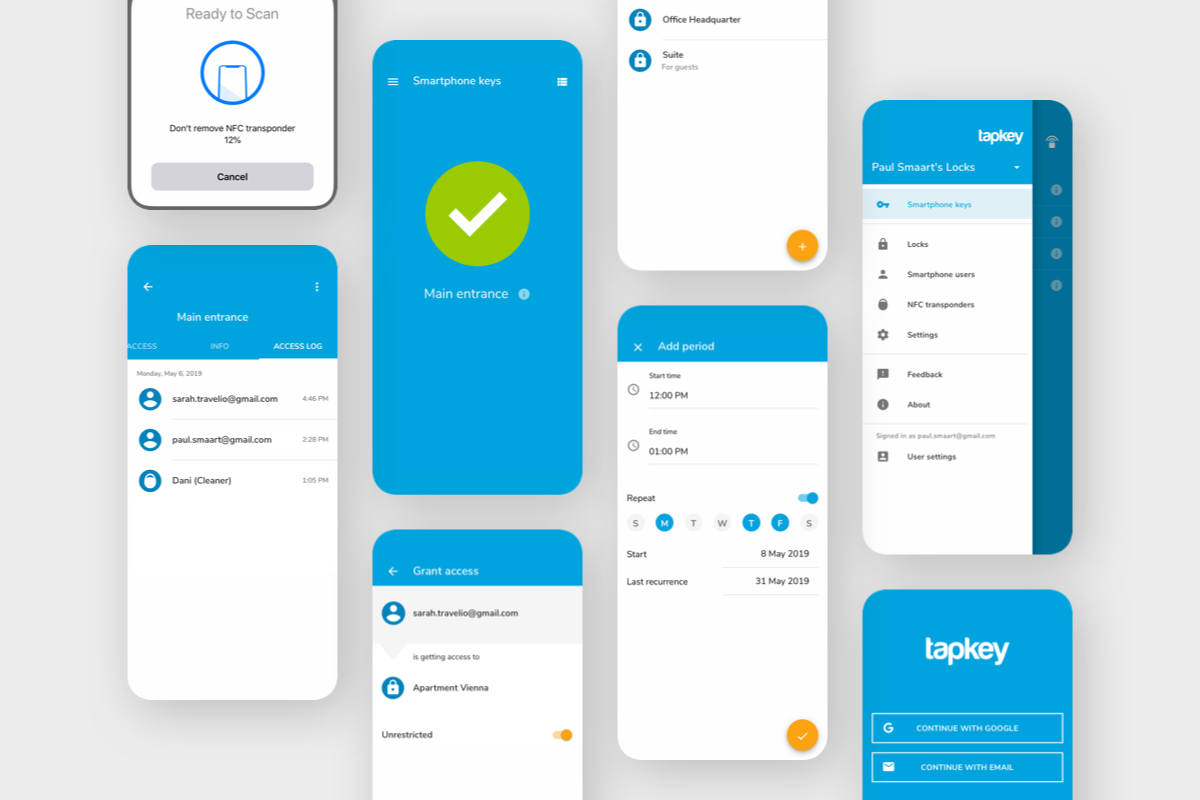
As the majority of users have Android phones, the user interface design of the app is adapted to the Google Material Design Guidelines. Nevertheless two versions of the app icons exist to guarantee a seamless visual integration in each OS.
Redesigning the Tapkey app with a lot of complex functionalities while still keeping it simple and engaging for the user brought along many learnings and iterations. The process consisted of breaking down and designing screens for each functionality and improving based on feedback given by the development team.
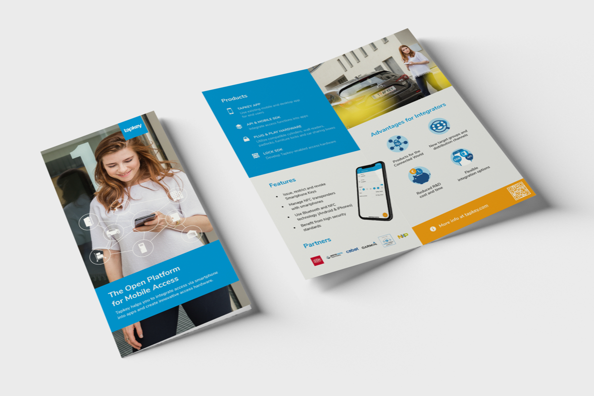
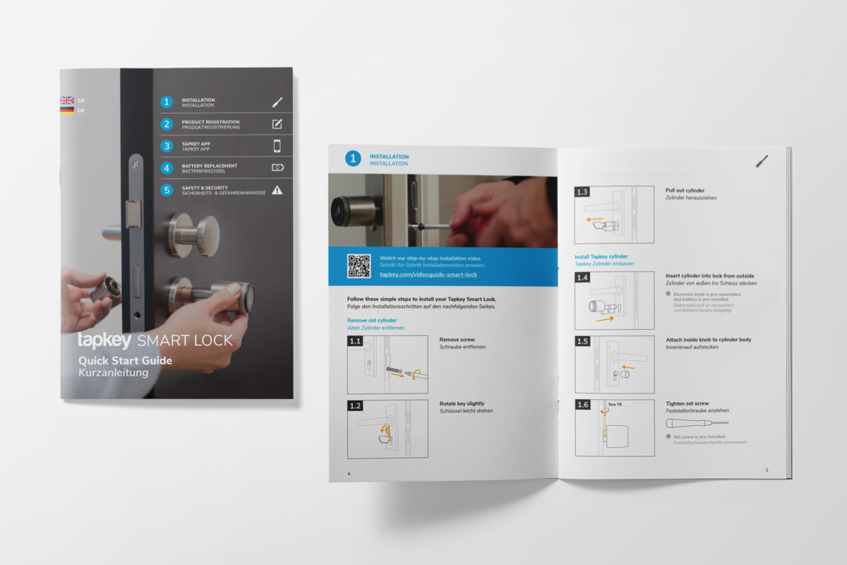
Clarity and bold use of color carries through printed marketing material like folders, operation manuals, packaging, exhibition booths, as well as digital products such as presentations, short animations for social media and the website.
Cooperating with an external development company, specialized in the e-commerce platform Shopify, the new website tapkey.com was implemented.
I provided layouts for all the pages as well as assets like buttons and effects. These also included vibrant icons and illustrations which are used to help breaking down the complex technology.
After the finished product was delivered I was responsible for maintenance and changes that needed to be made in HTML, CSS, Javascript and Liquid (Shopify’s template language).

