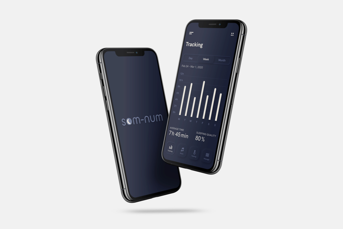
Som-Num
brand identity · ui/ux
Som-Num (from the Latin word somnum, meaning sleep) is a fictional startup which develops smart mattresses.
This project was generated by the website fakeclients.com.
Hi!
We are an up-and-coming startup based in Seattle that develops smart mattresses, called “Som-Num” (from the Latin word somnum, meaning sleep). Our business is still very young as we have just finished the Kickstarter campaign for our Bluetooth-enabled mattress. We don’t have a good logo yet and we actually need one before the end of this week because the pre-ordered mattresses are going into production next week.
We would like to have a simple, but recognisable icon for our logo. The logo should be able to be easily embroidered on the mattresses, so no complex designs. We are already developing an app to go with it so it should work on smaller screens and in an app store. The icon should appear fun and not too serious.
Below, we have listed some of our competitors with logos that we like: Casper, Helix Sleep, Tuft & Needle
Can you help us out?
Erica Perez
Founder and CEO of Som-Num
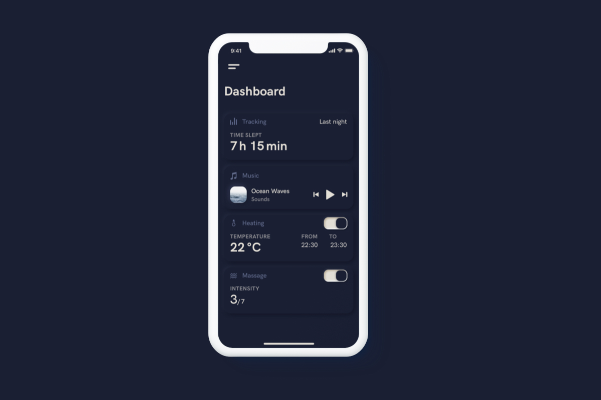
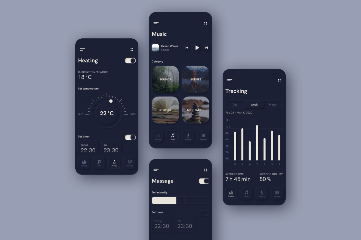
Starting off with a brainstorming on functions for BLE enabled mattresses only one realistic idea came to my mind: sleep tracking. To expand the project, more absurd functionalities like massage, heat regulation and playing music were added—everything that could help people fall asleep and be individually customized. Hence the Som-Num app unifies several apps in one.
For the chosen logo, inspired by the night sky, the moon in the »o« of Som-Num is accompanied by the soft, round font BC Alphapipe to convey the calm and comfort of a good night’s sleep on a comfortable mattress. Nevertheless the logotype is also linear, clean and modern to communicate a technologically advanced and innovative feeling. The figurative mark is simple enough to be easily recognized and used in various applications as app icon or embroidery on the mattresses. Simplicity and responsiveness in use of the logo were prominent factors for the decision making process.
Emphasizing the nocturnal color palette of dark blue tones and light beige for contrast, a strong use of the dark colors in branding would also help to accentuate differences to the known competitors Casper, Helix Sleep, Tuft & Needle, who all have a light appearance.
The main graphic style for the user interface is an approach of the new trend of neumorphism. It suits the topic with a reduced color palette, forms with big rounded corners and very big soft shadows to underline the soothing effect.
The home screen is a dashboard with all the settings of the functions at a glance, which can be changed and customized on separate screens for each function.