Tado
brand identity · print
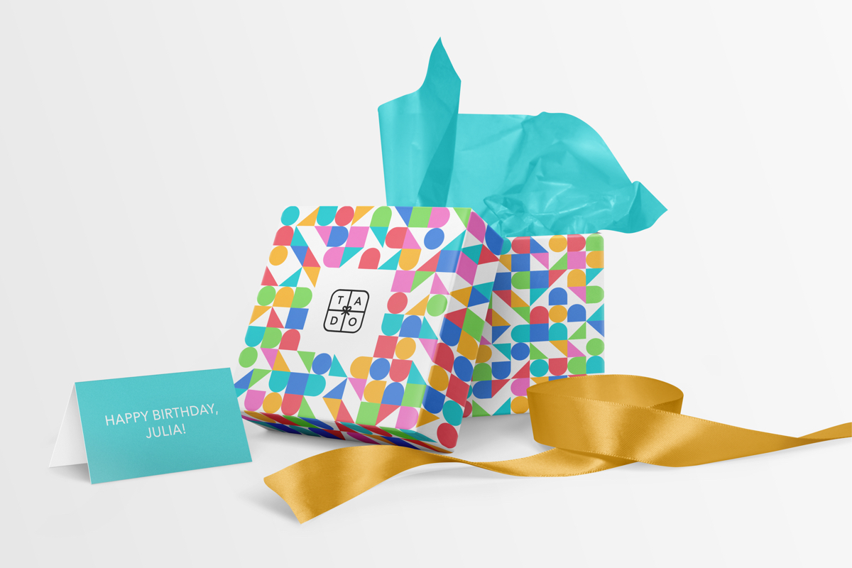
Tado is a fictional startup that helps people deliver gifts to others for their birthdays and other special occasions. Customers can also personalize their gifts using birthday cards and personalized tags.
This project was generated by the website fakeclients.com.
Hey,
We at Tado are in urgent need of a new logo. We’re a new startup that helps people deliver gifts to others for their birthdays and other special occasions. Via our app, people can select a gift from a wide selection of gifts that changes every week. They put in their payment details and their friend’s address information and we at Tado handle the packing and shipping. Customers can also personalize it using birthday cards and personalized tags. We received funding from various investors and have grown significantly in the past few years. The reason we need a new logo is that we currently aren’t hitting our investors’ targets and we’re hoping a new logo might help with that. We realize that a logo alone isn’t going to fix our problem but we thought a fresh new look, that is easy to remember, will keep customers wanting to come back. I think it goes without saying that our logo needs to be responsive to work as an app icon and needs to work well on our website. I would love to see what you could create for us in terms of a logo and how the logo would work responsively.
Best, Omar
Tado is in need of a fresh look, that is easy to remember and will keep customers wanting to come back. In the sketching process different options with letterforms in combination with the symbols of gift, bow and ribbon already contained a variety of different moods. I decided to go in a modern and fun direction rather than luxurious and serious (like the curled T emblem).

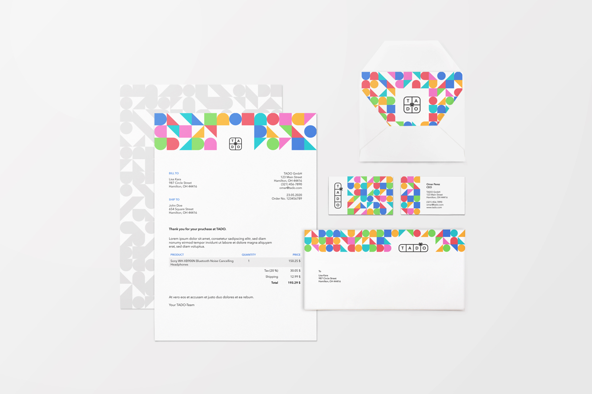
The chosen base logo has the form of a present box with a bow in the middle. Each letter as well as the bow can be positioned differently so a newly formed logo emerges. This flexibility emphasizes the customizability and individuality of the product Tado has to offer. The diverse and playful color palette supports this as well. The strong and clear Avenir offers contrast while strengthening the geometric shapes. The logo is kept in black and white, but can be colored for various purposes.
Six bright colors combined with four shapes which can be shifted in every direction build the main component of the visual brand language. Colors and shapes are generated randomly, but never the same ones next to each other. These elements continue the playful character of the brand and can be arranged in any way that suits format and purpose.

As customers of Tado can customize their order with birthday cards, and personalized tags, also the packaging is offered in a variety of designs. The logo remains in a square but its color adapts to the chosen design.
