MikroVeda is a European pioneer in liquid fermentation of microorganisms, positioning itself around a holistic approach to microbiome health. Studio Griesbacher-Tafner had already developed a new brand identity for MikroVeda, now our job was to bring that identity to life as a website—and, where the identity itself still had open questions, to help answer them.
Team
Ronja Schwarz (UI Design)
Studio Griesbacher-Tafner (CI Design)
Anja Frei (Project Management)
The Challenge
MikroVeda’s product portfolio had grown wide—arguably too wide. Internally, the team described themselves as “specialists in everything”, which is exactly the kind of positioning that dilutes trust rather than building it. The existing design read as almost childlike: playful colors, organic shapes, a casual feel that undersold the brand’s credibility. MikroVeda wanted to move decisively away from that, toward something that felt premium, professional, and clean, without losing warmth.
The added complexity: this wasn’t a rebrand from scratch. Studio Griesbacher-Tafner had defined the visual identity, and it was only partially finished by the time web design started. We had to design against a moving target—and were trusted to help finish it.
The Goals
Translate a still-evolving brand identity into a coherent, credible web experience
Shift the tone from playful toward lifestyle—without losing scientific credibility
Build a shop structure that fits every product category and body-area concern while still being easy to browse, even as the range keeps growing
Avoid alienating existing customers during a complete rebrand

Informational Structure
MikroVeda’s shop had to help visitors understand a product category most people don’t know much about, and get them to actually buy. We reworked the sitemap around that split: the shop is organized by product type (renamed by the client over time as the product line evolved), as well as body-area concern (with further categories added since), while a separate “Anwendungen“ section covers those same body areas from an educational angle—for visitors who arrive not yet knowing which product they need.
Wireframes were built SEO- and sales-optimized from the start: trust elements like expert quotes, scientific backing, customer reviews, purchase CTAs woven directly into the educational pages rather than kept separate from them, and a shop filter system that lets people shop by product type or by body concern.

Working Within a Brand in Progress
Rather than waiting for a finished brand guide that never fully arrived, we worked side by side with Studio Griesbacher-Tafner. CI-relevant decisions (like what a button should look like, or how a secondary color gets used in UI) were made collaboratively as part of the web design process, not handed to us as a spec. The signature moss-green accent, for example, was only added to the identity after the web design process surfaced the need for it.
That collaborative approach meant contributing real UI/UX expertise into a brand identity project, not just executing someone else’s system.

Design Exploration
We developed three directions and tested them with the client before converging on a final concept.
The Synthesis
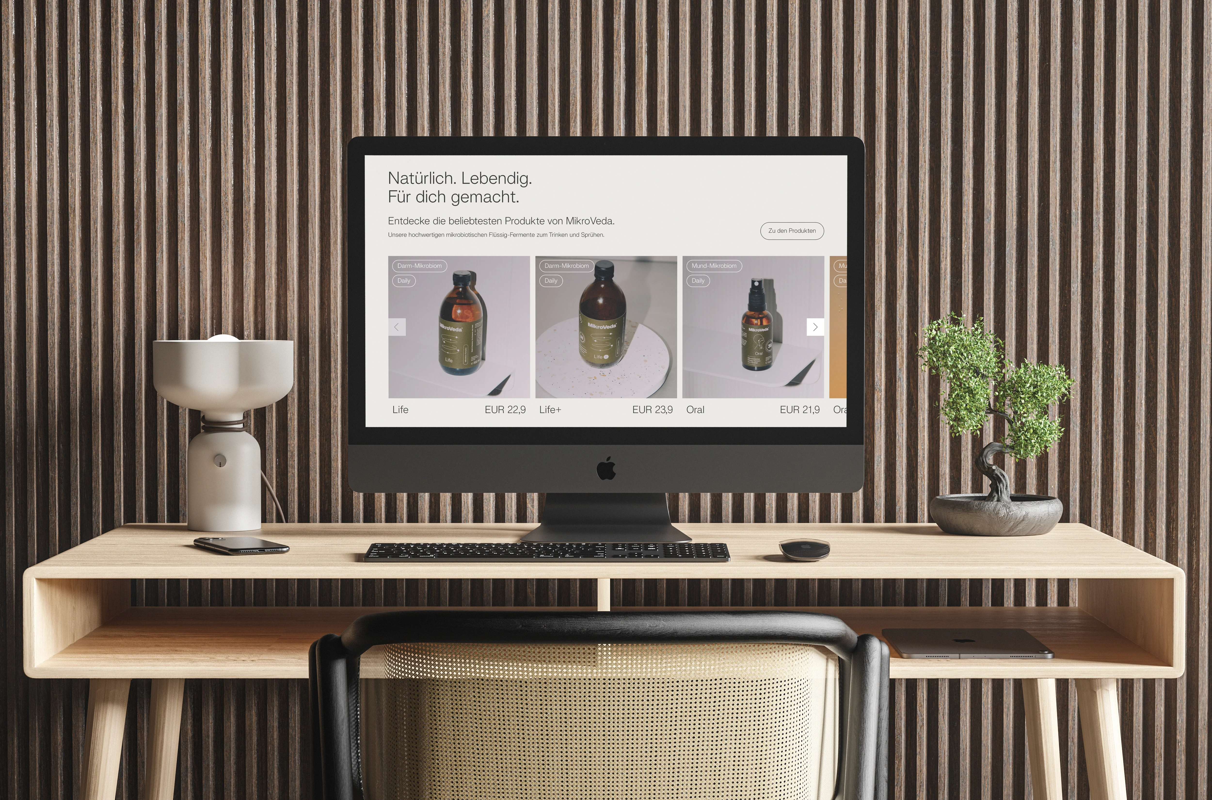
Further design work continued from concept 2 “Flow”—calmed down and rebalanced. Rather than leaning fully into asymmetry, the final layout moved toward a more classic structure, while keeping Flow’s large-scale imagery and fine linework for a premium, professional feel, plus a few carefully chosen interactive elements (slider, accordion). Generous white space carried through everywhere, and the MikroVeda wordmark was spelled out in full in the header rather than reduced to a mark, reinforcing legibility and trust over cleverness.


Key Design Decisions
Large, sensory visuals
Photography and video carry the emotional weight of the site—texture, taste, ritual—because a liquid supplement is a sensory product, and text alone couldn’t sell that.
Lab meets nature
The visual language deliberately blends laboratory precision with natural, organic material, because that tension is the actual essence of the brand: rigorously produced, but biologically alive.
An editorial aesthetic, deliberately
Getting the aesthetic right mattered enormously here: an editorial, magazine-like look and feel was essential to speak to the lifestyle side of the brand, not only its scientific credibility. Fine typography, considered imagery, and generous space carry as much weight in the design as any single UI pattern.
Restraint in color
A reduced color palette, with no strong color blocks on buttons or UI elements, keeps attention on the product photography rather than competing with it.

Collaboration
I led the project as art director, working closely with my colleague Ronja throughout. She contributed to the early concept work, and once the direction was locked, we continued designing and fine-tuning the remaining pages together.
Outcome
The site is live. The visual language has extended beyond the website into MikroVeda’s social media presence, and we also produce campaigns and social ads for them in this design—the client has been happy with the direction, a good sign that the balance between scientific credibility and lifestyle appeal actually landed.


Reflection
This project was less about executing a finished brand and more about finishing one, in real time, through the discipline of web design itself. An unfinished CI isn't unusual for us; clients often arrive that way, and we get real freedom to help shape it. What was unusual—and worked well—was doing that directly alongside the identity agency, rather than from a handed-off spec.
What I enjoyed most, though, was simpler: MikroVeda’s CI came with professional, well-shot photography and video we could actually use throughout the site (rarer than it should be).
I’m also proud of how well the collaboration with Ronja worked. She took my feedback and ran with it, and even though we had to make real compromises with the client along the way, we landed on a result we’re both genuinely happy with.

