Weinbau Greil produces award-winning wines in Straning, Lower Austria. Before the website redesign even started, I led the redesign of their entire visual identity—a new logo built on their historic family crest, typography, color palette, and print collateral from business cards to wine labels. The website was the next chapter of that same story: bringing a freshly modernized, generations-old winery online.
Team
Ronja Schwarz (UI & Brand Design)
Anja Frei (Project Management)

The Challenge
The core tension was the same one every heritage brand faces: modernize without erasing what makes it feel earned. Greil’s wine has real history behind it—the crest, the region, the craft—and a website that looked too contemporary would have thrown that away. A website that looked too traditional wouldn’t have done justice to the new identity we’d just built.
There was also a practical constraint: no developer was assigned to the project, so the site had to be built in WordPress without complex custom code. That didn’t rule out interactivity entirely, though: working from a template I adapted myself, I knew certain animation and interaction effects were achievable within its limits, like the parallax effect that ended up becoming one of the site’s signature touches.
The Goals
Launch a modern, elegant, easy-to-navigate site built on the new identity
Integrate a webshop for direct wine sales
Design something buildable in WordPress without a developer
Balance tradition and freshness—for both the brand and the winery itself
Brand Foundation
The identity redesign came first, and it set the vocabulary the website would later speak. The new logo reinterpreted the family’s historic crest rather than replacing it, and a gold-toned handwritten accent font was introduced to carry a sense of craft and signature quality across everything from labels to headlines. That combination (heritage shape, refined type) became the throughline for the entire brand, print and digital alike.

Design Exploration
We explored three distinct directions for the website before settling on the final approach.
The last concept became the final direction, because it was the only one that genuinely held tradition and freshness in the same frame: reduced, elegant, and quietly premium rather than loudly vintage or loudly modern.
One idea was tested and deliberately dropped: a 3D animation of the wine bottle for the homepage header. The client preferred a mood-driven image as the first impression instead—a more emotional, less technical opening to the site, which fit the brand better than a product-demo moment would have.

Key Design Decisions
Parallax imagery for mood, not spectacle
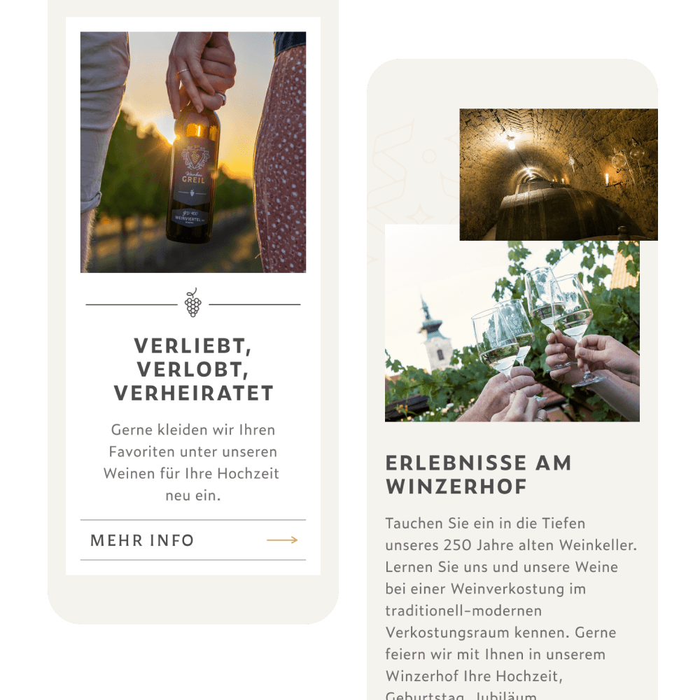
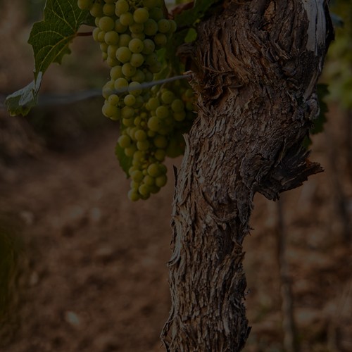
Overlapping, gently moving imagery sets atmosphere—the vineyard, the region, the process—without tipping into flashy interaction the client couldn’t maintain themselves.
Centered, spacious, precise
Centered compositions, large header imagery, generous white space and fine linework combine to create the elegant, refined feel the brand needed.
The label shape as a recurring motif
The distinctive shape of Greil’s wine labels was carried through as a recurring style element on the site, building visual continuity between what’s on the shelf and what’s on screen.
A handwritten gold accent
The same gold-toned script from the identity work appears as an accent font across the site, signalling craft and signature quality at key moments.


Collaboration & Implementation
The early concept direction was developed together with my colleague Ronja. From there, I took the design further and implemented the site myself in WordPress—starting from a template but adapting it fully to match the final design, rather than compromising the design to fit the template.


Outcome
The site launched to a positive response from the client, matching the approved design closely since I handled the build myself. The visual language established across identity and website has since carried into other areas of the brand as well.
Reflection
Owning both the identity and the website end to end made this project work. Because the brand vocabulary—the crest, the gold accent, the label shape—was mine from the start, translating it into a digital experience wasn’t a handoff, it was a continuation.
The 3D-bottle-animation idea we dropped is a good reminder that not every impressive execution is the right one. A quieter, mood-first opening served the brand better than a technically flashier one would have. Sometimes the more restrained option is also the more confident one.

