Österreichische Verkehrswissenschaftliche Gesellschaft
The “Österreichische Verkehrswissenschaftliche Gesellschaft” (ÖVG) is a non-profit scientific association founded in 1926, connecting politics, science, and industry around the future of mobility. Approaching its 100th anniversary, ÖVG needed a rebrand and a new website, without alienating a membership base that had known the organization one way for decades.
Team
Ronja Schwarz (UI & Brand Design)
Klemens Hechenberger (Development)
Anja Frei (Project Management)

The Challenge
This wasn’t a rebrand with a clean slate. ÖVG’s identity and website were genuinely outdated, but the organization was recently restructured and downsized, its membership skewed 50+ and not especially tech-comfortable, and—notably—the redesign was being driven by a young female CEO inside an organization traditionally led by older men. That made the project a sensitive internal moment as much as a design one: real skepticism from members and partners, real risk of the change reading as a break with the organization’s identity rather than an evolution of it.
On top of that, ÖVG’s content was genuinely complex (publications alone span articles, journals, podcasts, annual reports and books) and needed a system that could hold all of it without becoming visually chaotic.
The Goals
A modern, contemporary identity and website that still reads as unmistakably ÖVG
Sharpen ÖVG’s actual USP—a scientific platform with substantiated publications—versus competitors leaning more on networking events
Reach a younger audience without alienating the existing, older membership base
Build a system flexible enough for ÖVG’s wide range of content types
Deliver a full CI package: logo, two sub-brands, typography, color, icons, print collateral, CD manual
Working With Constraints as Design Input
The client was explicit about what had to survive the redesign: red had to remain the primary color and the logo could not drift any closer to the visual language of ÖBB (Austria’s national railway) or borrow the orange/gray palette of a direct competitor. Those weren’t limitations to work around—they became the brief’s actual center of gravity: how modern can this get while still being unmistakably, reassuringly ÖVG?

Design Exploration
Concepts were developed across a spectrum—from calm, ordered, and conventionally conservative, to noticeably more experimental—before converging on a considered mixture. The final direction needed to carry two things simultaneously: the organization’s long-standing tradition and scientific credibility, and a sense of modernity, freshness, and forward motion appropriate to a mobility-focused institution.

Key Design Decisions
A calibrated circle motif
The logo’s circular element was tested at different levels of visual presence throughout the system. Too prominent, and it felt restless across a content-heavy site; used deliberately and only where context called for it, it reinforced the brand without adding noise—a balance we landed on through iteration, not by default.
Color and imagery treatment, balanced deliberately
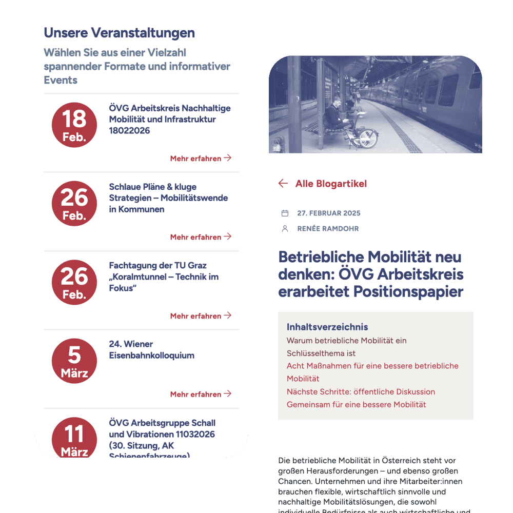
Full-color photography was set as the default, since a monochrome or heavily blue-overlaid treatment risked feeling too cold for an organization trying to feel more approachable. Overlays were reserved specifically for recurring, repeated content—blog thumbnails, people, working-group imagery in grids—where a consistent treatment aids scanning rather than working against warmth. It also solves a practical problem: when members or partners upload their own photos of varying quality, a consistent treatment keeps the site looking coherent regardless of the source material.
A structure built for content complexity
With publications alone spanning articles, journals, podcasts, annual reports and books—and events, working groups, and news layered on top—the real design problem was taxonomy across the entire site, not just one content type. Clear typographic hierarchy and consistent spacing rules did most of that work, holding events, publications, and everything else together as one legible system.

Design System
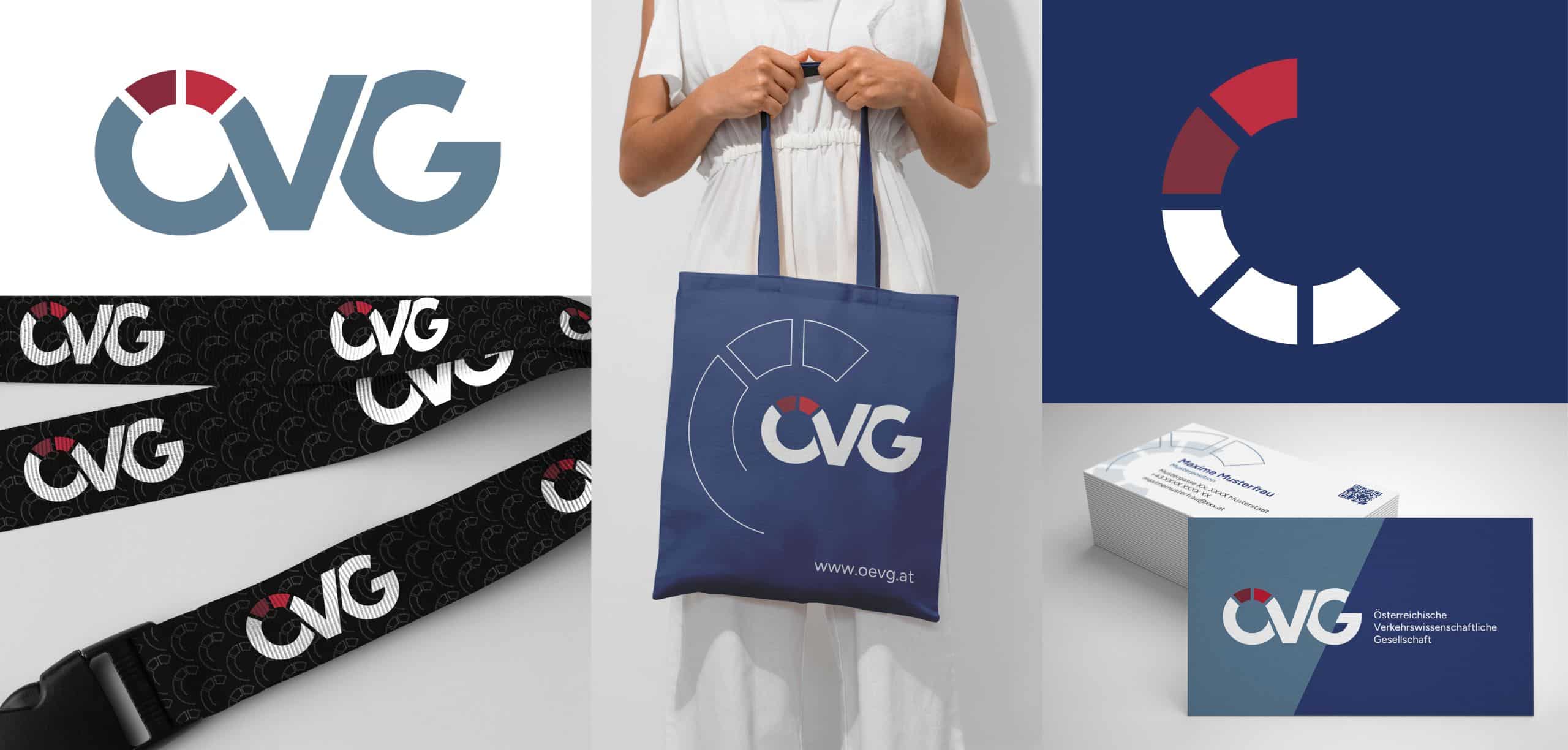
Beyond the website, the project delivered a full CI package: the redesigned logo plus two sub-brand logos (Junge ÖVG and ÖZV), a logo kit prepared for both web and print, defined typography and a primary-plus-secondary color system, a secondary style element, a consistent icon language, business templates (business cards, letterhead, envelopes, stamps), redesigned roll-ups, and a compact CD manual documenting it all for future use. Given ÖVG’s internal team would need to apply this identity themselves long after launch, documentation wasn’t an afterthought, it was part of the deliverable.
Collaboration
I led the project overall, but the balance of work shifted by phase: My colleague Ronja carried much of the CI development and the print materials, working closely with me, while I took the lead on the website itself, with her help along the way. The design system, its digital assets and components, was mine to build.
Outcome
The new identity and website are live, and the visual language has carried through into ÖVG’s print materials as well—a good sign that the system holds up beyond the screen it was designed on first.
Reflection
At its core, the project was about turning something outdated into something new—pushing modernization inside a traditionally conservative membership. The constraints the client gave me weren’t obstacles to design around; they were exactly what sharpened the final identity.

